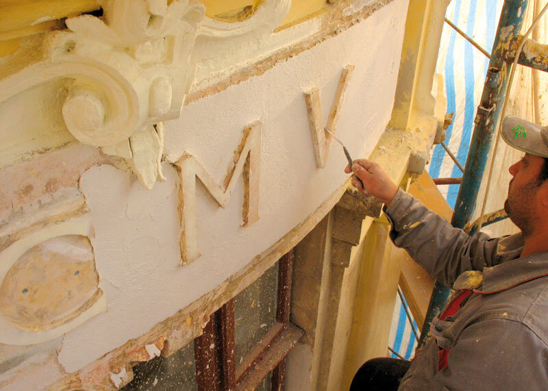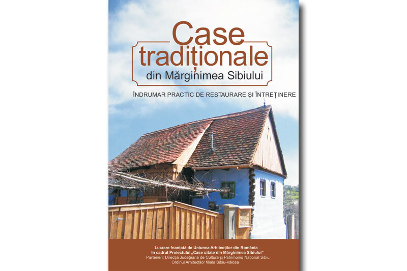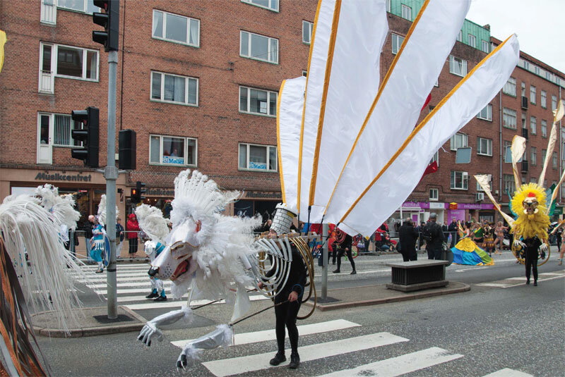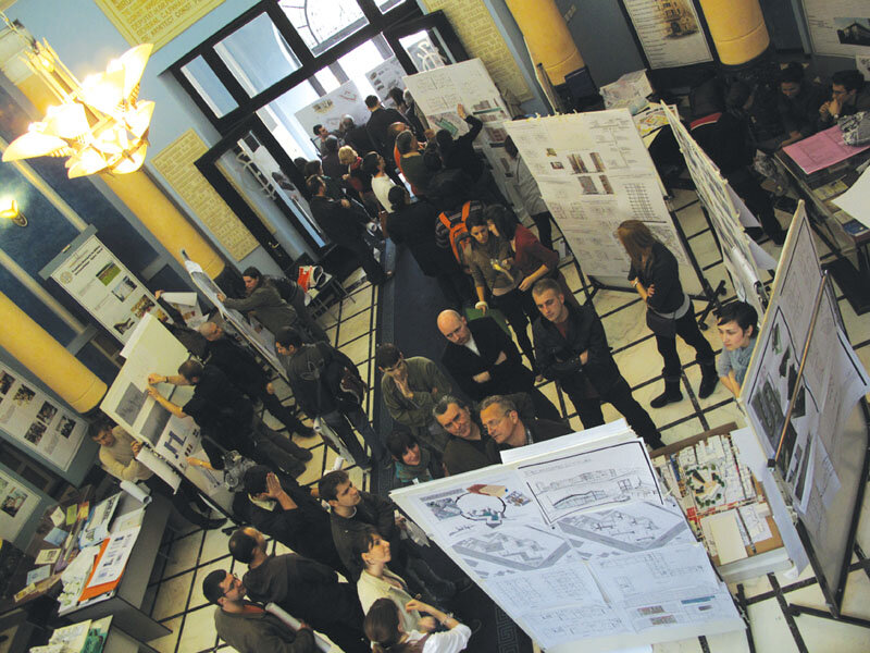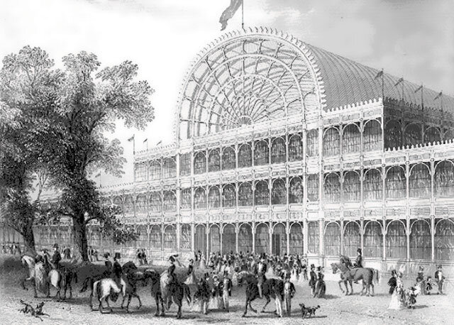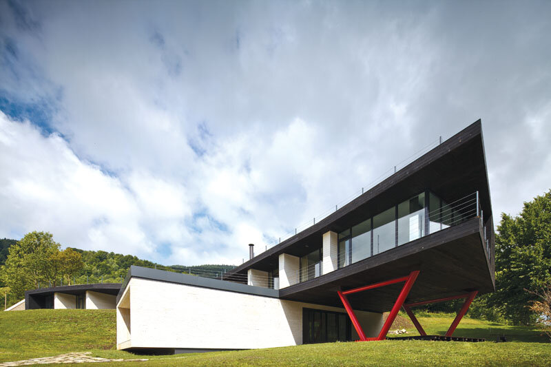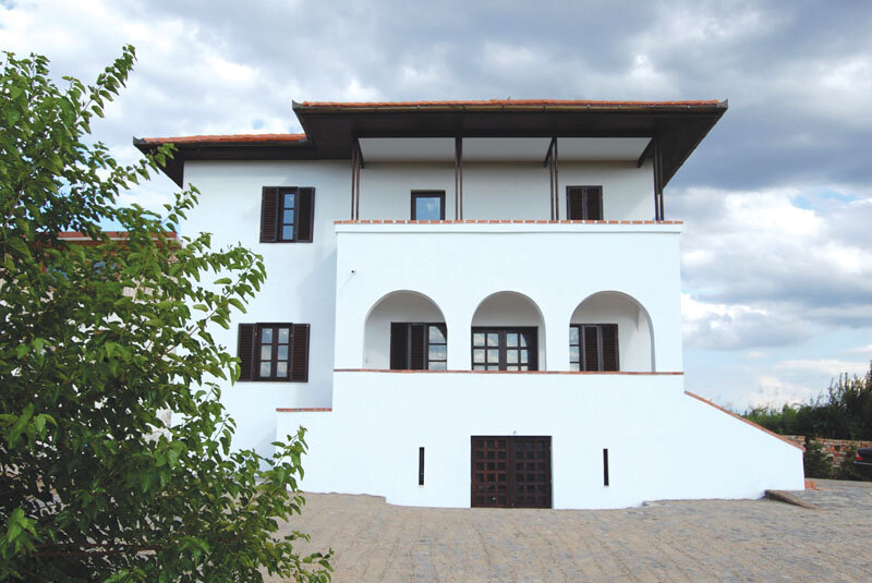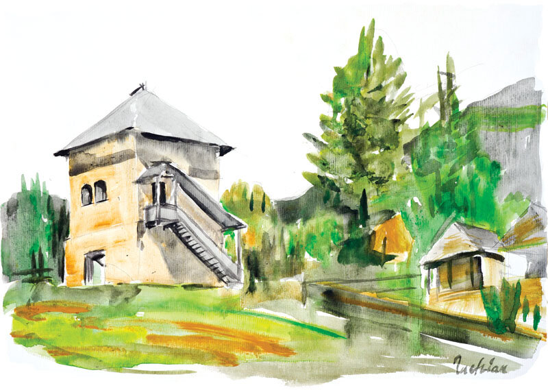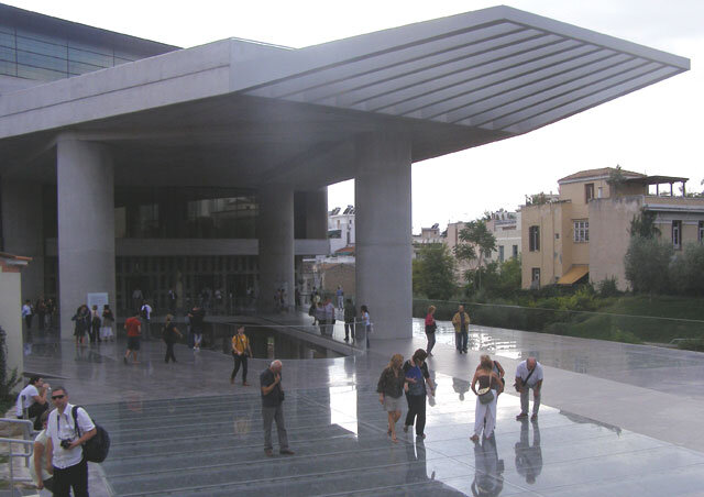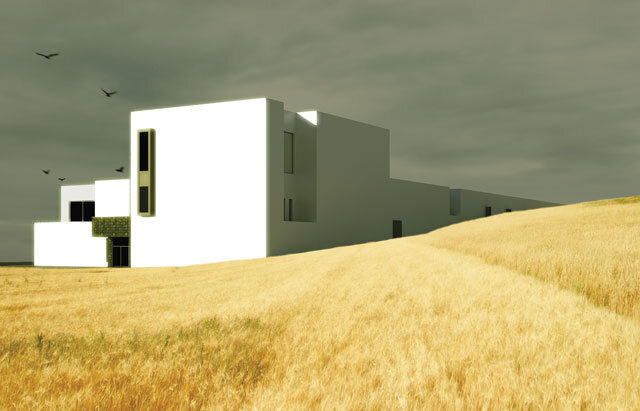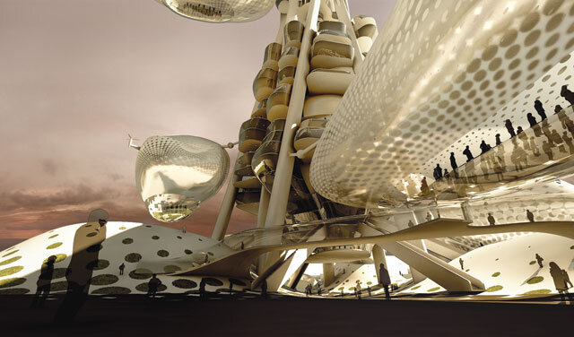
Anuala de Arhitectură București 2011 - Premiul secțiunii arhitectură, categoria locuințe: Extindere, supraetajare și remodelare locuință - arh. Rovana Moga, arh. Juan Carlos Negretti B.
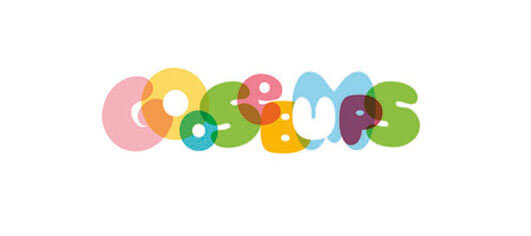
The transparency in the visual identity
| De la început, ar fi necesar să se facă o precizare cu privire la transparența desenului de identitate (care definește o companie sau un produs), că are puține în comun cu politica de transparență a unei societăți, numai declarată (sau reală).
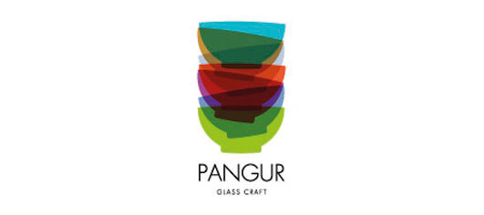
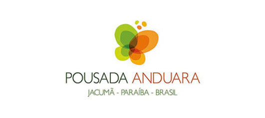
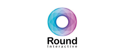
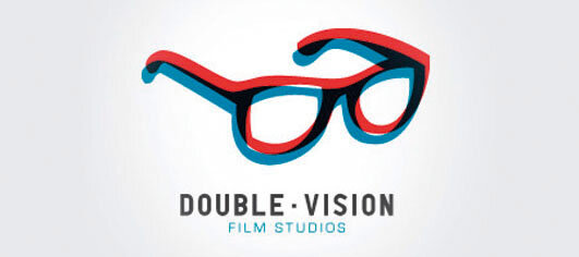
Proprietatea fizică a unui corp de a lăsa să se vadă prin el forma, culoarea, detaliile altui corp, transparența a fascinat dintotdeauna! Un motiv generos, exploatat și dezvoltat deopotrivă prin nenumărate tehnici de lucru. Interesant în percepția generală este că, pentru a-i reda perfecțiunea, transparența n-o putem sugera decât incompletă sau ireală (eronată). Un logo trebuie să fie în măsură să spună, în câteva secunde, o poveste despre lumea sa. Indiferent dacă este vorba de o companie, un produs sau o industrie, povestea trebuie să fie coerentă și clară. Este bine de știut, un design de identitate bun trebuie să aibă niște proprietăți foarte bine motivate: - Integrare naturală cu numele; - Linie generală specifică pentru industria din care face parte; - Cromatică aleasă cu responsabilitate; - Desen deosebit. Atrăgător ori nu, acesta trebuie să fie memorabil. Designul pop și psihiedelic, reprezentativ pentru anii ’60-’70, a creat premiza de a folosi efectul transparenței în identitatea vizuală, apoi, din motive tehnice, transparența a fost uitată o vreme. Prin anii 2002-2004, din nou, a devenit un star pentru o mulțime de lucrări de design de identitate. |
| Citiți textul integral în nr 4 / 2011 al Revistei Arhitectura. |
| From the beginning, it would be necessary to make a clarification about the transparency of the identity design (which defines a company or a product) and state that it has little to do with a company’s policy of transparency, be it only declared (or real).
As the physical property of a body of allowing one to see through it the shape, color, and details of another body, transparency has always fascinated! A generous motif customized and enhanced through many working techniques. What is interesting is the general conviction that in order for transparency to be perceived entirely, it must be represented in an incomplete, distorted, unreal (or erroneous) manner. A good logo has to be able to say, in a few seconds, a story about its world. No matter if is about a company, a product or an industry, the story must be coherent and sharp. It is good to know that a good identity design must have some very well reasoned properties: - Natural integration with the name; - General line of the industry to which it belongs; - Chromatic chosen with responsibility; - Special drawing. Attractive or not, it should be memorable. The pop and psychedelic design, representative for the 1960s-1970s, created the premise for the use of the transparency effect in visual identity; afterwards, for technical reasons, transparency was forgotten for a while. Throughout the years 2002-2004, it became a star once again for numerous identity design works. |
| Read the full text in the print magazine. |