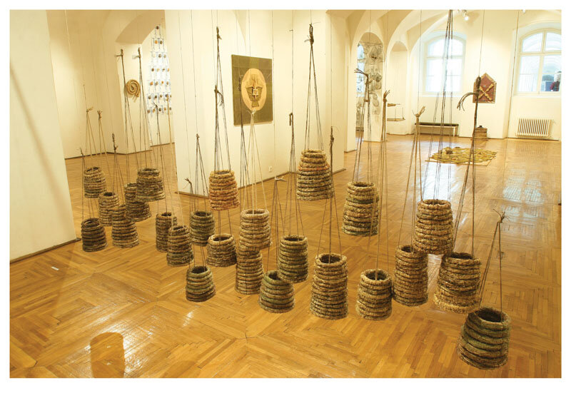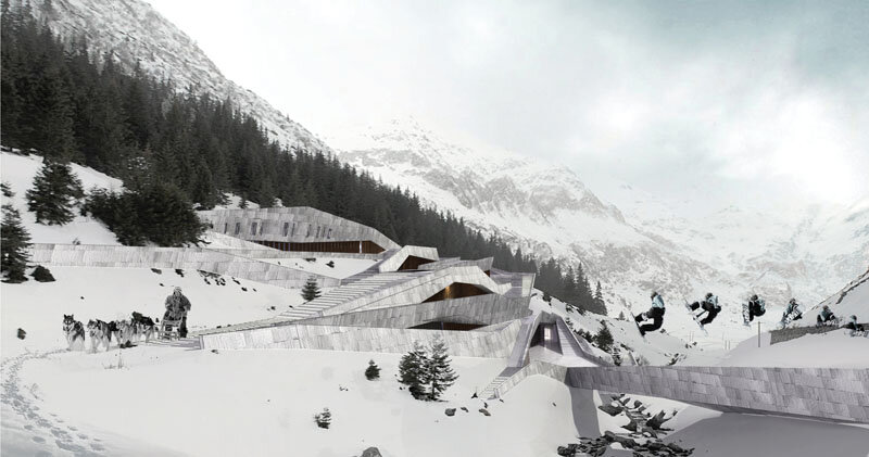
Ricardo Legorreta awarded Praemium Imperiale
The transparency in the visual identity
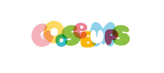
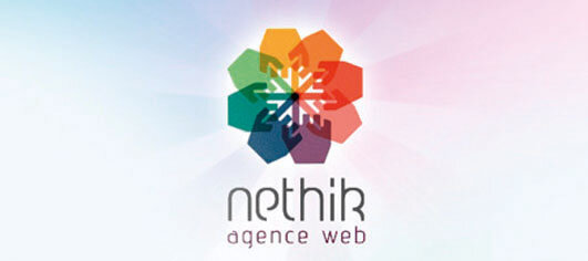
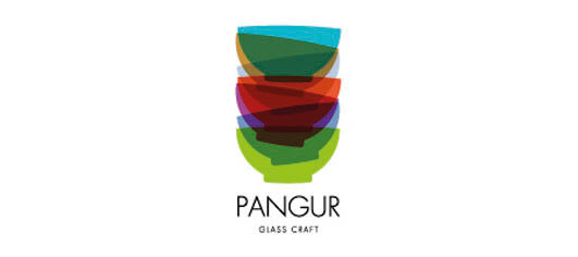
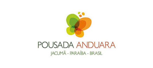
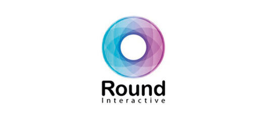
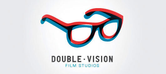
| At the outset, it would be necessary to make a clarification about the transparency of the identity design (which defines a company or a product), that it has little in common with a company's policy of transparency, only declared (or real). The physical property of a body to show through it the shape, color, details of another body, transparency has always fascinated us! A generous motif, exploited and developed through countless techniques. What is interesting in the general perception is that, in order to render its perfection, transparency can only be suggested as incomplete or unreal (erroneous). A logo must be able to tell, in a few seconds, a story about its world. Whether it is a company, a product or an industry, the story must be coherent and clear. It's good to know, a good identity design must have some very well reasoned properties: - Natural integration with the name; - General line specific to the industry it belongs to; - Responsibly chosen colors; - Great design. Eye-catching or not, it has to be memorable. Pop and psychedelic design, representative of the 60s and 70s, created the premise of using the effect of transparency in visual identity, then for technical reasons transparency was forgotten for a while. By 2002-2004, it again became a star for a lot of identity design work. |
| Read the full text in issue 4 / 2011 of Arhitectura magazine. |
| From the beginning, it would be necessary to make a clarification about the transparency of the identity design (which defines a company or a product) and state that it has little to do with a company's policy of transparency, be it only declared (or real). As the physical property of a body of allowing one to see through it the shape, color, and details of another body, transparency has always fascinated! What is interesting is the general conviction that in order for transparency to be perceived entirely, it must be represented in an incomplete, distorted, unreal (or erroneous) manner. A good logo has to be able to say, in a few seconds, a story about its world. No matter if is about a company, a product or an industry, the story must be coherent and sharp. It is good to know that a good identity design must have some very well reasoned properties: - Natural integration with the name; - General line of the industry to which it belongs; - Chromatic chosen with responsibility; - Special drawing. Attractive or not, it should be memorable. The pop and psychedelic design, representative for the 1960s-1970s, created the premise for the use of the transparency effect in visual identity; afterwards, for technical reasons, transparency was forgotten for a while. Throughout the years 2002-2004, it became a star once again for numerous identity design works. |
| Read the full text in the print magazine. |